

The fairytale book “Below the Floor” with a quick and dirty placeholder cover.
Last week, finally a little package arrived.
Inside were the prototype books I had ordered to check the look and feel of the fairytale Below the Floor.
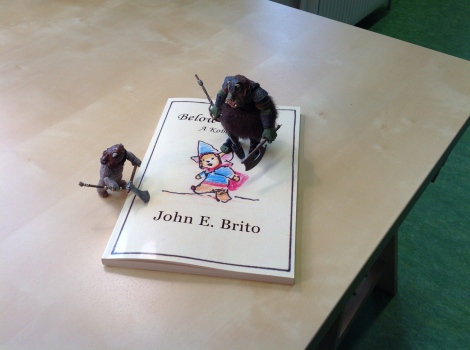
It was thicker than I thought it would be. When I was writing Below the Floor, I thought that it would be somewhere around 3 or 4 millimetres, like a thin magazine, but it turned out to be anywhere around 1 cm. Hm, nice.
Of course the cover you can see above is just a placeholder, as I haven’t drawn the final cover yet. Also, the fonts, line spacing, position and aligment of the illustrations will change, as I did not care about that when I was pasting the text and paintings into the layout programme. The advantages of doing quick and dirty prototypes is something I learned soon after had finished university, when I did in old school HTML (websites) and usability consulting. But this was another life.
Apart from checking the look and feel of the story as a whole, I had printed these prototypes because I wanted to have something to send to my friends who will give me story feedback. I wanted something more to send than just a PDF file.
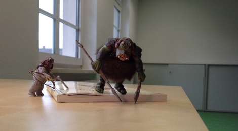
A Gamorrean Guard and an Ewok checking the width of the book.
And I wanted to see where potential layout problems could arise before I (or someone else) start doing the real layout work (after the book was translated). It was worth doing so, because there were some illustrations which worked really well for themselves, but did not when layouted into a book. Like the image below, where you can see Gordo Vego, one of the kobolds, in his kitchen: I thought, that it would look cool, if the illustration spread to the adjacent page and went over the page (into the bleed). It did not.
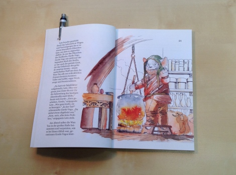
While it looked sweet in the layout programme, it did not work in the printed version. There were several images that had similar problems, but which I won’t post at this moment, because they would spoil too much of the story. 🙂
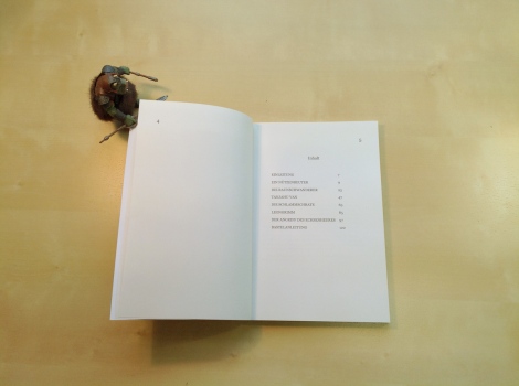
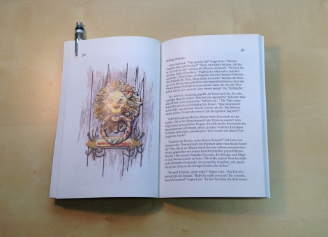
But this is nothing you can’t fix. The solution is simple: Going back to a more traditional text/illustration-arragement, like I did with the portrait of the grumpy doorknocker. This illustration was intended from the very beginning to be placed on a page without any text above or below, very much like in fairytale books from the 1920s or 1950s.
There is still a ton of detail work to be done, like adjusting the size, placement and font type of the page number, block text, and so on. But, still, it felt somehow special finally holding a printed prototype – even though it was full of flaws and unfinished – in my hands. 🙂
Oh, and I haven’t been lazy the weeks I was waiting for the printed books. I have started a new story already, but more about that later.

I want to read it!!!
LikeLike
Hi Ronny, you will, just give some more time 🙂
LikeLike
Wow, looks great. You must be so excited to finally get a look at what the finished book will be like 🙂
LikeLike
Thank you very much, Paul. Yeah, and I’m really looking forward to finally get it finished :)))
LikeLiked by 1 person
The prototype certainly looks interesting. I like the idea of laying the illustration on one side and the text on the other, although sometimes when the illustration is smaller it could kinda grow out of the page if surrounded with text. Anyway, it looks amazing.
LikeLike
Yes, you are right, I also love it, when in some of the old fairytale books the text wraps around the illustrations 🙂
LikeLike
Pingback: Self Publishing VS Traditional Publishing, Pt. II | I create worlds. John E. Brito's Blog·
Congrats, finally seeing your book in print is a really big deal!
LikeLike
I still got something of a path lying ahead of me, because it was just a prototype print, but it already gives a little bit of the feeling of “what could/will be” in the near future. 🙂
LikeLiked by 1 person
Who printed your book? I already tried some print-on-demand-services and I am always interested in experiences of others.
LikeLike
Hi Wolfgang! I will print the softcover version through https://www.createspace.com/ This is the print-on-demand book publishing service of Amazon. But beware, you will need a US tax ID if you do so.. I did not know that before. The hardcover version is not printed yet, but druck.at and wir-machen-druck.de are favourites to the moment. I have ordered some samples from wir-machen-druck and the paper looks really fine. I guess I will use uncoated “Naturpapier 150g”, which is quite heavy…love the paper and love the feeling the paper has. I think that is as good as it can get if you are doing digital printing (but that is purely subjectice).
LikeLike